Let’s cut to the chase. You’re not just building an app that displays information. You’re building a tool to solve a real, everyday problem: the awkward, clumsy, and often failed exchange of contact details. The success of this tool doesn’t hinge on having the most features. It hinges on one thing: simplicity. If your business card app UI design isn’t mind-numbingly simple, people will delete your app and go back to fumbling with paper cards. It’s that stark.
So, how do you build an interface that makes sharing contacts feel effortless? You focus on the user’s moment of need and remove every single point of friction. This isn’t about fancy animations (though they can be nice). It’s about creating a seamless path from “Hi, nice to meet you” to “Got your details, thanks!”
This guide will walk you through the core principles of designing a UI that people will not only use but love. Let’s break it down.
Golden Rule To Build a Business Card App UI Design
Before we talk pixels and buttons, you must adopt a mindset. Imagine your user is at a loud conference. They have one hand holding a coffee. They’re trying to make a good impression while also remembering the name of the person they’re talking to. This is not the time for a complex menu or a confusing layout.
Your business card app UI design must be built for this scenario. Every decision should be guided by the principle of speed and clarity. If a user has to think for more than a second about what to do next, your design has failed. The ultimate compliment your app can receive is a user saying, “I didn’t even have to think about it.”
Principle 1: The First Impression – Designing the Profile Creation Flow
The user’s journey begins the moment they open your app to create their digital card. This is your first test. A complicated, lengthy sign-up process will make them quit before they even have a card to share.
The goal here is to get them from download to “ready to share” in under a minute. How do you achieve that? Break it into small, digestible steps. Don’t present them with a single, overwhelming form with twenty fields.
Use a progressive flow. Start with the absolute essentials: Name, Company, and Phone Number. Let them complete that and get a “shareable” state immediately. Then, encourage them to “add more later” with friendly prompts for their email, website, and social links.
Offer smart helpers. Use auto-fill from LinkedIn or their phone’s contacts to pre-populate fields. This reduces typing and effort dramatically. The UI for this should be clear, with big, tappable buttons that say “Import from LinkedIn” rather than a tiny, hidden icon.
Most importantly, provide a live preview. As they type their name, they should see it appear on a visual representation of their card in real-time. This immediate feedback is rewarding and confirms they’re on the right track. It turns a tedious task into a creative one.
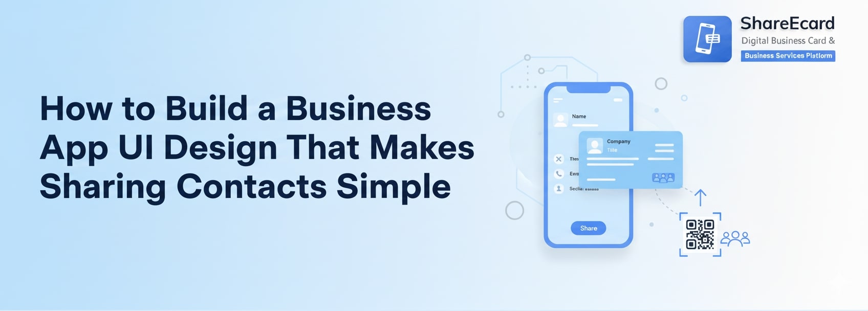
Principle 2: The Main Event – Designing the “Share” Button
This is the heart of your app. The entire purpose of the tool is to share information quickly. Therefore, the share functionality shouldn’t be *a* feature; it should be the feature. Your business card app UI design must make this action the biggest, most obvious, and most accessible element on the screen.
When a user opens the app, the primary button should be impossible to miss. It should be prominently placed, have a clear label like “Share My Card,” and be visually distinct with a bold color.
But it can’t stop there. A single share method is not enough for every scenario. The true magic of a great UI is in how it elegantly handles multiple options without feeling cluttered. Tapping the main “Share” button should reveal a clean, simple menu of choices:
QR Code: This is a superstar. The UI should display a large, clean QR code that others can scan instantly. Ensure the screen is bright and the code is centered perfectly. Consider a subtle animation that draws the eye to it.
NFC Tap: For high-end phones, this is the ultimate in simplicity. The UI should give clear instructions: “Tap phones together.” Use simple graphics or animations to guide the user through this potentially new action.
Share Link: The app should generate a short, clean URL. The UI should provide a big “Copy Link” button and seamless integration with other apps like WhatsApp, Gmail, or Messages for direct sharing.
The key is that all these options are presented clearly and simply from one central hub. The user should never have to dig through settings to find how to share their card.
Principle 3: The Other Side – Designing the “Receive” Experience
A great digital business card app UI design isn’t a one-way street. It’s a network. Your UI must be just as thoughtful for the person receiving a card as it is for the person sharing one. This is where many apps drop the ball.
If someone sends you their digital card, what happens? The worst outcome is that it opens in a web browser and the recipient is left staring at a page, unsure how to save the information.
Your business card app UI design must make saving a contact a one-tap action. When a recipient views a shared card, a giant, friendly button should say “Save to Contacts.” Tapping it should seamlessly add all the information directly into their phone’s native address book, with no extra steps.
Think about the non-users too. If someone without the app scans a QR code, they should land on a beautiful, mobile-optimized web page that still has that giant “Save to Contacts” button. This ensures the experience is smooth for everyone, not just people who have downloaded your app. This vastly increases the utility and shareability of your platform.
Principle 4: Clarity and Consistency – The Visual Language
Simplicity is not just about workflow; it’s about visual clarity. Your interface needs to breathe.
Use plenty of white space. Don’t cram elements together. Ample spacing makes the app feel calm and easy to parse, especially in a stressful social situation.
Typography is key. Choose a single, easy-to-read font for all body text. Use a different, complementary font only for headings or names to make them stand out. Ensure your text sizes are large enough to read quickly.
Color should be used as a functional guide, not just decoration. Use a primary color for your main actions—the “Share” button, the “Save” button. This creates a visual path for the user’s eye to follow. Stick to a simple color palette of two or three colors to avoid a chaotic, confusing interface.
Icons are a universal language, but only if they are universally understood. Use standard, recognizable icons for phone, email, and website links. Avoid abstract, creative icons that users will have to guess the meaning of. Every icon should have a clear text label beside it, especially for less common actions.
Principle 5: Making it Personal – Customization Without Complexity
People want their digital card to feel like their own. They want to express their personal or company brand. However, offering customization can be a dangerous path that leads to a complicated, bloated UI.
The trick is to offer smart customization, not unlimited choice. Instead of a complex color picker with millions of shades, offer a curated palette of a dozen well-chosen, professional colors.
Instead of letting users upload any background image (which often leads to clashed text), offer a selection of subtle, minimal patterns or the ability to set a simple background color.
Provide templates. A well-designed template system is the perfect balance between personalization and simplicity. Users can choose a template that fits their style—”Modern,” “Professional,” “Creative”—and then simply edit the content. The business card app UI design for this should be a visual grid of template options, making it easy to browse and select.
Putting It All Together: The Home Screen
The home screen is your command center. It needs to balance all these functions without feeling busy. A successful home screen UI for a business card app often includes three key elements:
First, a large preview of the user’s own card. This acts as a constant reminder of what they are sharing and reinforces their brand.
Second, the colossal, unmissable “Share” button, placed centrally or in a easy-to-thumb location at the bottom of the screen.
Third, a simple tab bar for navigation. Tabs like “My Card,” “Network” (for received contacts), and “Settings” provide clear pathways to other parts of the app without cluttering the main view.
This layout prioritizes the primary action (sharing) while still providing access to everything else. It’s clean, focused, and direct.
Conclusion: Design for the Handshake
Building a business card app isn’t about coding a database of information. It’s about designing for a moment of human connection. Your business card app UI design is the digital equivalent of a smooth, confident handshake.
It should be intuitive, professional, and over in a second, leaving both parties feeling connected and positive. By obsessing over simplicity, guiding the user with a clear visual hierarchy, and solving the real-world problems of sharing and saving, you don’t just build an app.
You build a habit. You build a tool that becomes a natural part of how people interact. And in the world of tech, that is the ultimate sign of success. Now go build something simple.